







SEBASTIÁN ARQUITECTOS / Sergio Sebastián
Architects / collaborators: Alejandro Alda, Giorgio Bernardi, Laura Martínez, Valeria Gasparini, Michela D´Angelo, Joanna Statucka
Technical architects: Carlos Ruiz , Mario Galán, Pablo Sebastián
Structural assistants: Matute Manrique, José Ángel Pérez Benedicto. Installations: Pilar Fiteni - Prodia. Furniture: Atri
Promoter: Mutua de Accidentes de Zaragoza
Builder: Acciona
Photographs: Irene Ruiz / Sebastián Arquitectos
Area: 2500 sqm.
Year: 2021
Awards: XXXVII Premio García Mercadal Colegio Oficial de Arquitectos de Aragón.

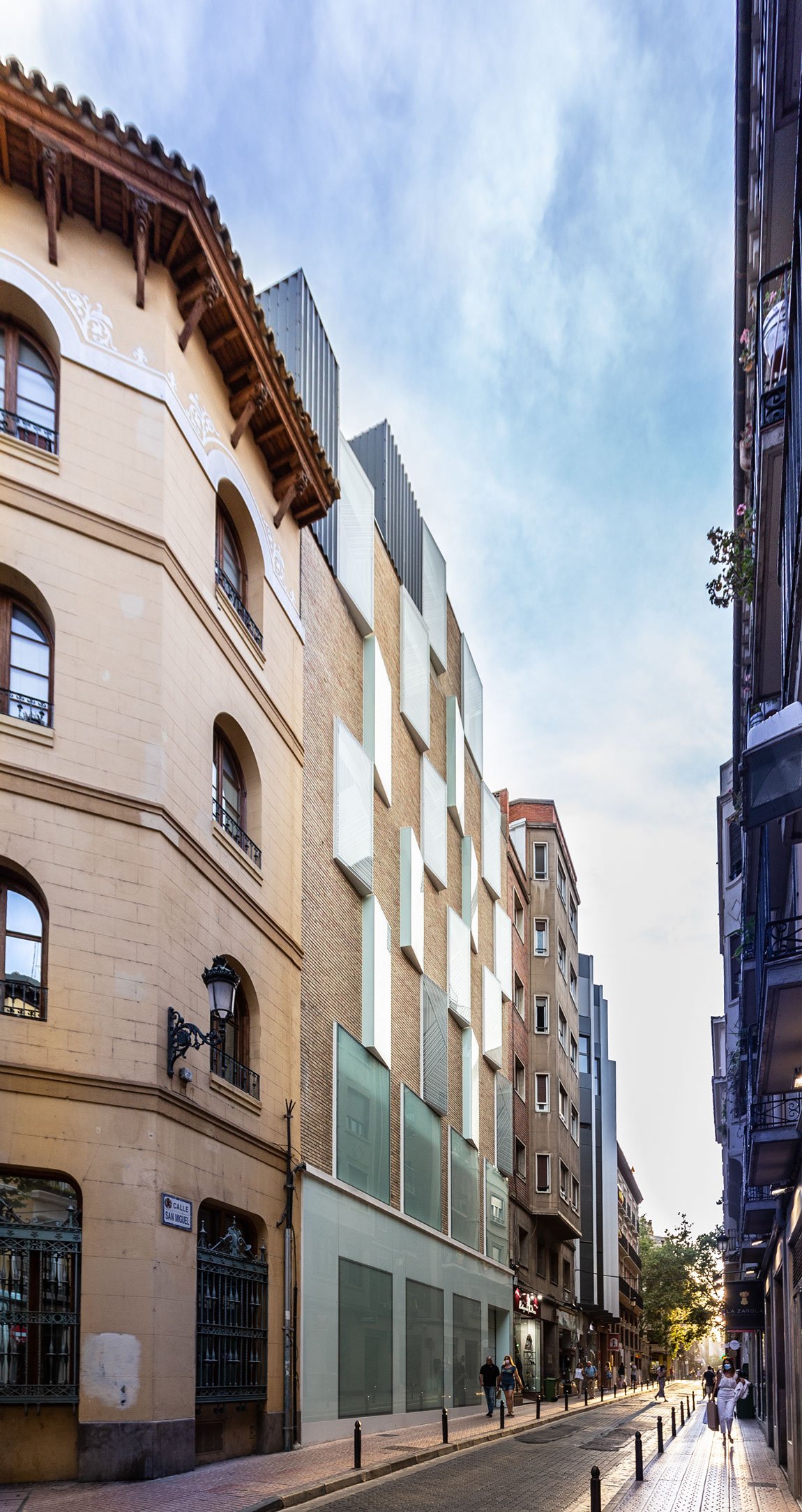
The headquarters of the Mutua de Accidentes de Zaragoza is located in a group of buildings that are grouped on the corner of Calle Sancho y Gil and Calle San Miguel in the historic center of Zaragoza. The main access is through the building that Teodoro Ríos built. Due to program adaptation needs, an extension is required, for which the MAZ once again recovers the old adjoining maternity block, designed by Lorenzo Monclús in 1966, and which would later be conditioned as a municipal music conservatory until it was abandoned. That block was formed as an element of seven floors, not very generous in size, which were organized around a central courtyard that ran the entire height of the building. Its modulated brick facade established in the street a visual reference typical of a new time that was advancing contemporaneity.

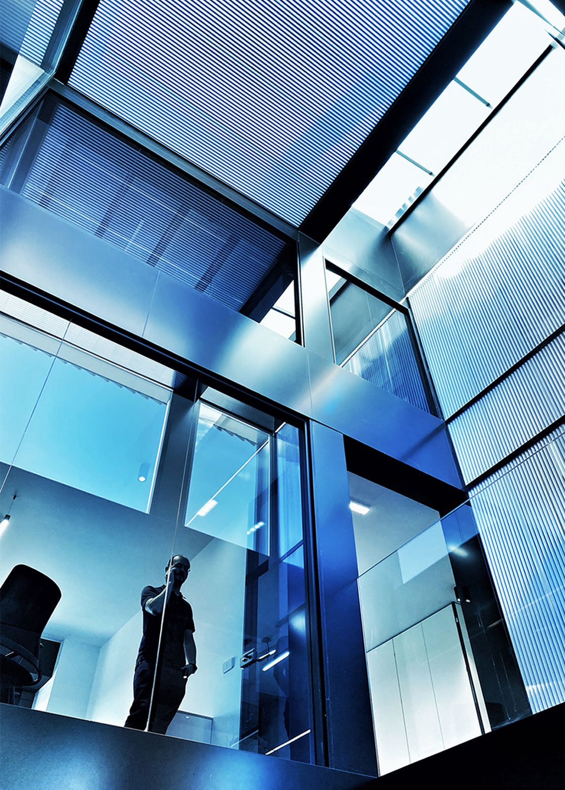
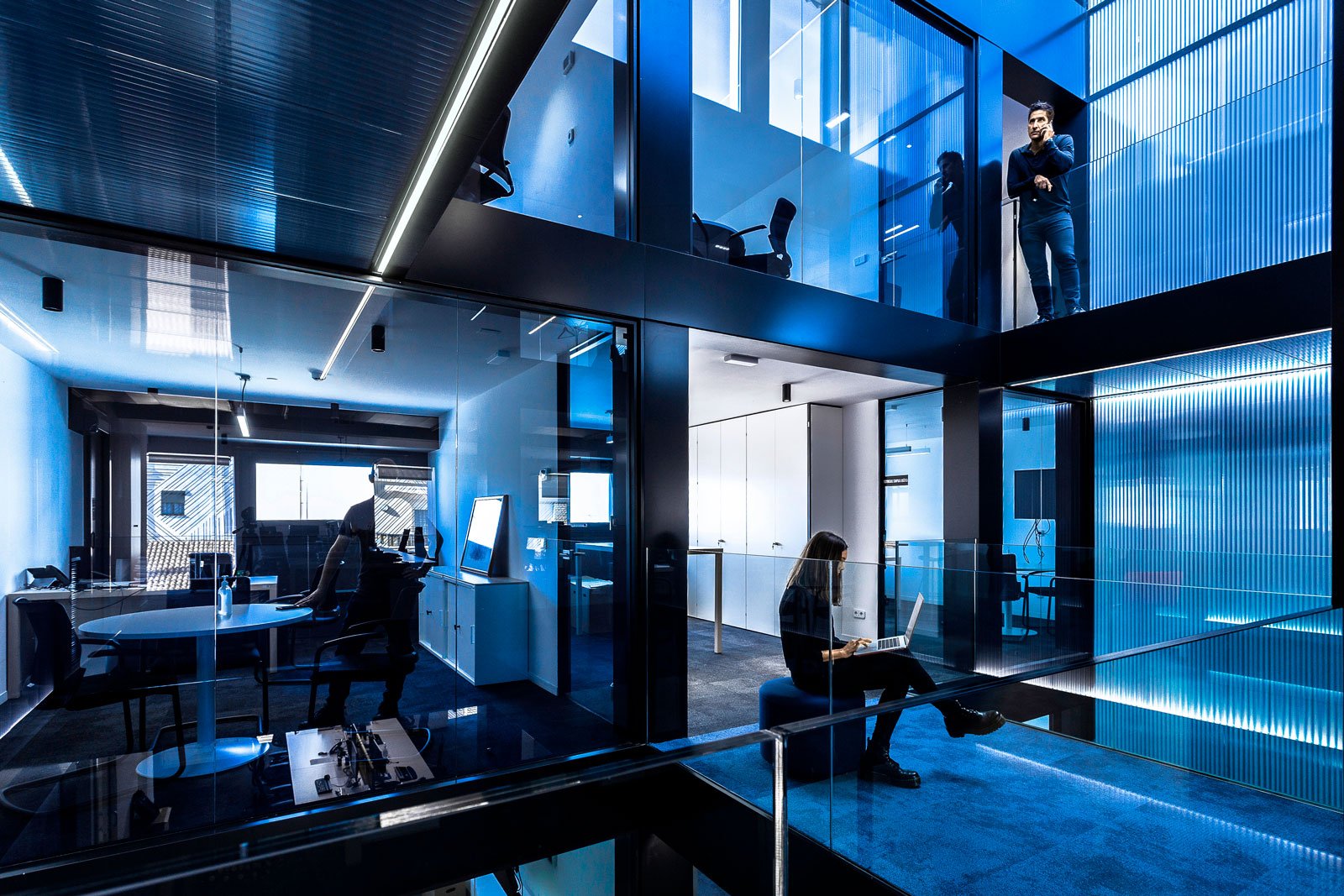
The rehabilitation project is planned from the respect to that central patio, as the main element capable of articulating the entire section of the building, stitching it through a magical void of reflections and light that reach the ground floor. The strip of the interior patio also separates the two natures of the work space, a landscape office open to Calle San Miguel, and a block of individual and meeting offices that are shown as an interior façade, a building within the building.

Both natures, whose difference is also manifested in the material treatment, are united and communicated by a system of staggered walkways that pattern the void and visually relate the different levels, providing a great spatiality to the whole that was not previously available

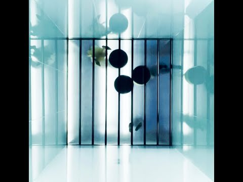
In addition, in the old backyard of the historic building, the general program is expanded with an area for various uses that contributes to a higher quality and performance of the space for workers. The strategy used, similar to that applied in the old conservatory, has been to build a new spatial atmosphere, open and wide, through mechanisms of reflections and glass patios that multiply the narrow area that was available.

Three green patios invade the continuous space with their visual freshness and guide the uses of office, rest, and meetings. Through the geometry of the walls and ceilings, and the use of clear and specular materials, the new area is shaped like a curious and magical garden in the heart of the city.
